
Small Fish UX Consulting & Graphic Design


The newly launched Interaction Design (UX) Department at Vodacom needed a memorable, high impact logo that would communicate their scientific and evidence based approach to design. The bold colour and clean, simple forms used here give the logo precise scientific feel. Simple, vivid colours combine to create a high impact mark that is both memorable and easily recognisable
as a part of the greater Vodacom brand.

This logo was designed for a farm covered with Jacaranda trees. The client requested that the logo incorporate a Jacaranda tree and use the typical purple of their flowers. The tree is stylized in a way that describes freedom while the purple background has the dream like quality of a sky at night. The serif typeface and somewhat antique decoration around it talks to the farm's age and established history.

The Great Hall is a wedding venue characterised by strong classical architecture dominated by pillars.
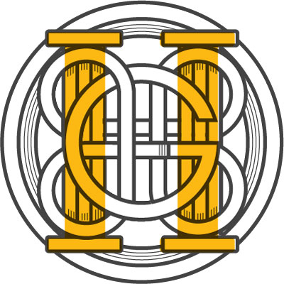
The logo is designed as a monogram which combines the pillar and Mobius loop as metaphor of marriage. In this way two separate elements are brought together or combined in an eternal bond. The letters "G" and "H" have been worked into the design to represent the words “Great Hall". A monogram is used as its old world feel gives the logo a the sense of longevity and tradition. Its stylised lines echo the stone carving found in the building while the yellow center implies that the viewer looking through a window into a warm hall where people are celebrating.



Peopletree needed to create visual cohesion across all their products while giving the viewer a sense that each product was different. The structure of the logos, typeface and stylisation of the symbol element creates coherence across the logo family. Colour and symbols are used to differentiate each product and help the viewer remember what each product does.

Designed for a Scottish dog grooming parlor
the feel of this logo is one of care and approachability. The contemporary typeface and clean lines talk to the business' modern approach. The typesetting of the text allows for the description "parlor" to be easily substituted for other descriptors describing future business the owner wanted to develop under the same brand
(E.G. Bonnie Pet Treats).

Veloton is a supplier of high-end road bicycles and bicycle parts. The blue image element that morphs to form
the second "O" of the word "Veloton" shows a stylised cyclist moving at speed. The contemporary typeface and slight surface reflection allude to the brands slick, high-tech products while remaining tactile and inviting. The careful integration of image and type create a simple, cohesive and recognizable image which can be easily applied
to any media.

A whimsical logo created for the internal marketing team at Vodacom. Based on the concept that they were "constantly pulling it out of the hat" the logo is designed to reference the imagined logo of an 1800's magician.

EWOR recycles oil and wanted to be perceived as clean, contemporary and environmentally friendly. The leaf and oil drop image element illustrates the function of the business as an oil re-cycler whilst the sans serif typeface gives the logo a clean contemporary feel.


Biokool is a high-tech lubricant used in CNC
machines to cool and lubricate the CNC router bit as it cuts. The contemporary typeface reinforces the product's high tech nature. Greys and cool teals give the viewer a sense of the product's function as a coolant. The swirl shapes over the "K" talks to the cool, lubricated point
of a CNC router bit.




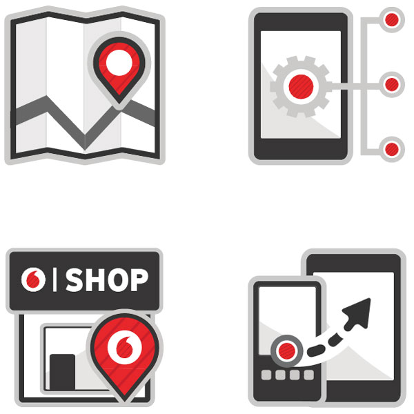

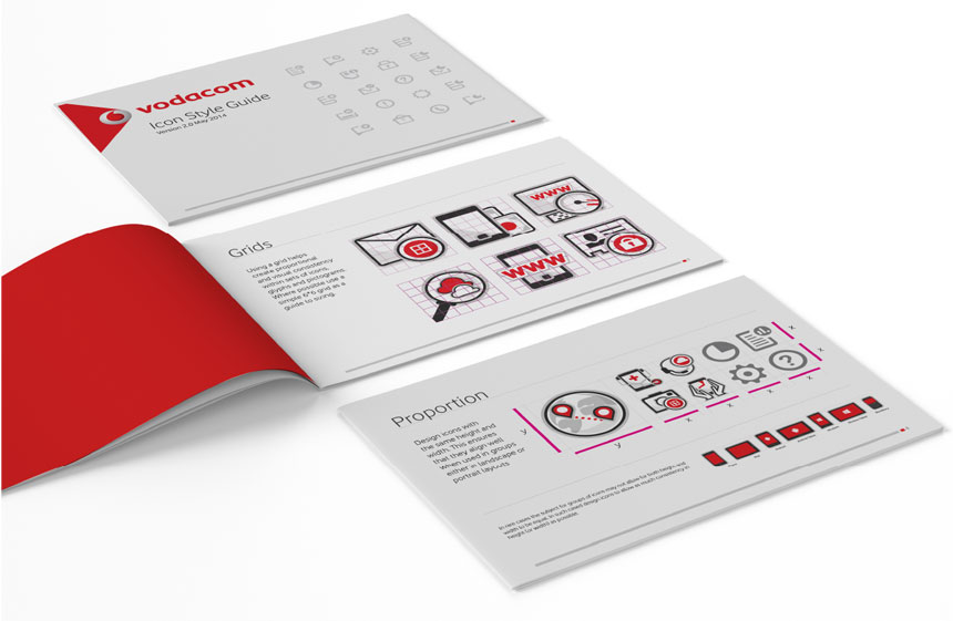
Vodacom has lots of suppliers that create visual assets for the company so maintaining a consistent visual identity across a brand can be challenging. To ensure that any icons created are consistent with the existing Vodacom icon sets and corporate identity this style guide was created.
Like to see some more of my work or chat about how design can make your business better?